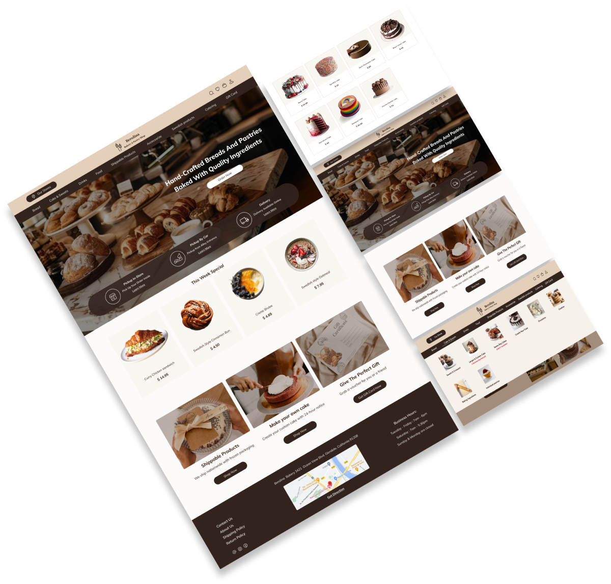
Berolina Bakery & Pastries Website Redesign


Berolina is a bakery and pastry shop website that offers handcrafted bread and pastries, featuring two pickup options (by car and in-store) as well as delivery services.

UX-UI Designer
Group of 2
2 months-part time
Figma, Photoshop, Maze Miro, Zoom
Due to the business’s emphasis on selling its products online, the website does not effectively convey its mission or the services it provides. However, to increase sales and attract more users, the business has decided to enhance the presentation of its values, goals, and activities.
Our research methodology is based on three key methods:
Before doing user interviews, we performed a heuristic evaluation of the website to discover the main usability issues, and to get a better insight on what to focus on during the user research.
The website’s design and content are outdated and many issues were noticed.
We started by identifying bakeries and pastries websites with similar objectives to gain a clearer understanding of the essential features of our design. We conducted a thorough analysis of these platforms to grasp their overall structure and functionalities, providing valuable insights for our own design process.
We conducted interviews with 7 users and created an affinity diagram to analyze their feedback, helping us identify key insights and pain points that guided the redesign of the bakery website to improve user experience and meet customer needs.
Here are some quates mentioned by users in interviews:
How do users feel and think about the Berolina website?
To conclude the research findings, we also used a user journey map in this project to analyze the current state of the user journey.
Who is the user of Berolina website?
The website will be redesigned based on the Persona’s needs and preferences.
What redesign decisions did we make?
Before starting the redesign process, we conducted usability testing on the current website with a group of users to identify pain points, gather insights on user behavior, and understand areas needing improvement. The most important takeaways from our research are pain points and solutions.
The moodboard and color palette, inspired by wheat, coffee, and bread, brought the bakery’s essence to life online. Using warm, natural tones, we created an inviting, comforting, and appetizing website, mirroring the in-store experience.
To design high-fidelity interfaces, we upgraded the Berolina UI Kit, refining its colors, fonts, and element dimensions. These updates ensure consistency across all screens, align with the website’s requirements, and meet user needs.
What did our users think?
You can see a few examples of the iterations that were done.
This A/B test was run among 8 participants. We evaluated the user satisfaction and functionality of two different designs.
Considering the users with various visual disability, we tried to design accordingly. Below are the screenshots considering the “Color Blinds”.
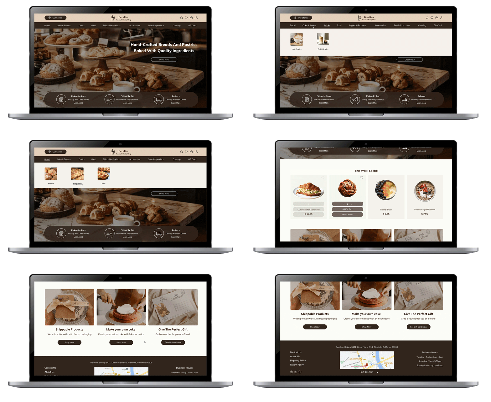
Take a look at our final high-fidelity Designs, complete with colors and images!
