Dallas Flower Florist

Flower & Plant shop website redesign
About Dallas Flower Florist shop

Dallas is an online flower and plant shop that serves customers across the USA, Canada, and Mexico, offering high-quality, fresh flowers and plants to provide an exceptional shopping experience for plant enthusiasts throughout North America.
Project Overview

Role

UX-UI Designer

Team

Group of 2

Duration

2 months-part time

Tools

Figma, Photoshop, Maze Miro, Zoom

Problem Statment:

Dallas website suffered from poor information architecture, outdated design, insufficient product descriptions, limited filtering options, and a lack of product comparison features, which decreased sales and reduced customer engagement.

Goals:

  • Improve the website’s information architecture to enhance navigation and usability.
  • Categorize products more intuitively to help users find and explore items easily.
  • Add advanced filtering options to help users find products easily.
  • Allow users to ship multiple items to different addresses during the shopping process.
  • Include detailed product descriptions to increase clarity and customer confidence.
  • Specify plant sizes and dimensions to meet user concerns.
  • Add a review section to enhance readability and usability.
  • Enhance the visual appeal of the online shop with a modern design.

The Process

Our team of two ran a Double Diamond Design based on the Design Thinking Methodology. It was not a linear path, we bounced between stages as the project progressed.

Discover

Define

Develop

Deliver

Discover

Research Methodology:

Our research methodology is based on three key methods:

  • Heuristic evaluation helps us find usability problems quickly.
  • Competitive analyses show what others do well and how we can improve.
  • Interviews let us understand people’s thoughts and experiences.

Heuristic Evaluation:

To better understand which issues to focus on, our team performed a heuristic evaluation of current websites.

The following are a few results of our investigation.

Competitive Analysis:

We conducted a competitive analysis of similar websites to identify key strengths and weaknesses, analyze user experience approaches, and uncover opportunities to enhance our design strategy.

 Top takeaways:

  • How to present business values
  • Intuitive product categorization.
  • Detailed plant sizes and dimensions.
  • Advanced filtering options.
  • Access to customer reviews.
  • Multi-address shipping functionality.

Interview (Qualitative Data):

We interviewed 9 potential users to gain valuable insights into their needs, preferences, and challenges.

Affinity Diagram:

After creating the affinity diagram, we identified the most important factors in the user’s view as follows:

  • Clear and detailed information needed.
  • Interest in care guides.
  • Exact size and dimensions required.
  • Reviews and high-quality images expected to build trust.
  • Clear navigation and filters expected.
  • Simplified Address Entry Process Required.

Define

Journey Map:

How do users feel and think about the Dallas website?

To conclude the research findings, we also used a user journey map in this project to analyze the current state of the user journey.

Persona:

Who is the user of Berolina website?

The website will be redesigned based on the Persona’s needs and preferences.

Card Sorting:

How do users think the website should be organized?

To understand how to organize the different sections of the website for more intuitive navigation, we conducted 9 remote card sorting sessions with potential users. The results from our analysis of the card sorting activity led to the redesign of the information architecture and site map.

Site Map:

How did we design the information architecture?

Based on the results of the competitive analysis and card sorting, we developed the site map. 

Develop

Ideation & Wire-framing:

What redesign decisions did we make?

The most important takeaways from our research are pain points and solutions.

( Home Page )

(Category Page)

(Product Page)

(Shopping Cart)

(Plant Size Information)

Deliver

UI Design Direction:

For designing high-fidelity interfaces, I defined a design system consisting of colors, fonts, and dimensions of elements that should be consistent on all screens.

Mood Board:

The mood board and color palette are inspired by nature and designed to reflect elegance and simplicity, creating a calm and inviting experience for users.

UI Kit:

We developed a complete UI kit to serve as a reference for templates and components. This kit ensures that interface development is smooth, consistent, and efficient throughout the project.

Usability & Iteration:

What did our users think?

Throughout the project, we went through multiple iterations, driven by the insights we gained from usability tests. These tests were instrumental in shaping our decisions and constantly enhancing our project. Some of them are mentioned below.

(Hero Section)

(Product Page)

(Category Page)

A/B Testing:

We conducted A/B testing with 6 participants to identify which design elements resonated best with users, enabling us to make data-driven decisions to enhance the website’s overall user experience. Below, we have mentioned examples of theirs.

Design base on WCAG:

Considering the users with various visual disability, we tried to design accordingly. Below are the screenshots considering the “Color Blinds”.

Delivered Design Page:

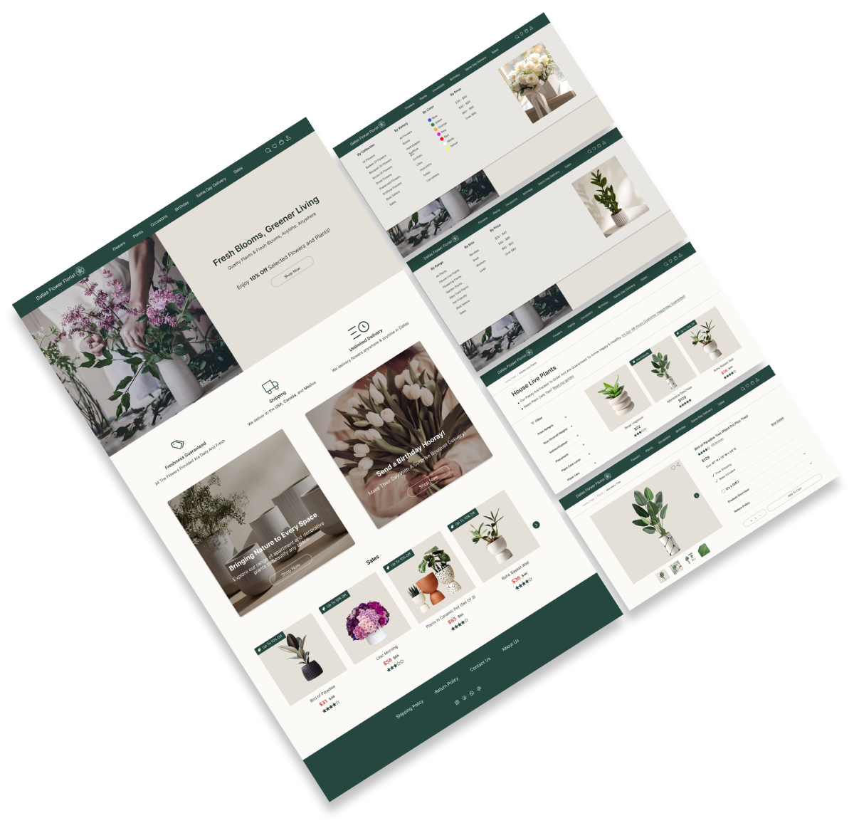
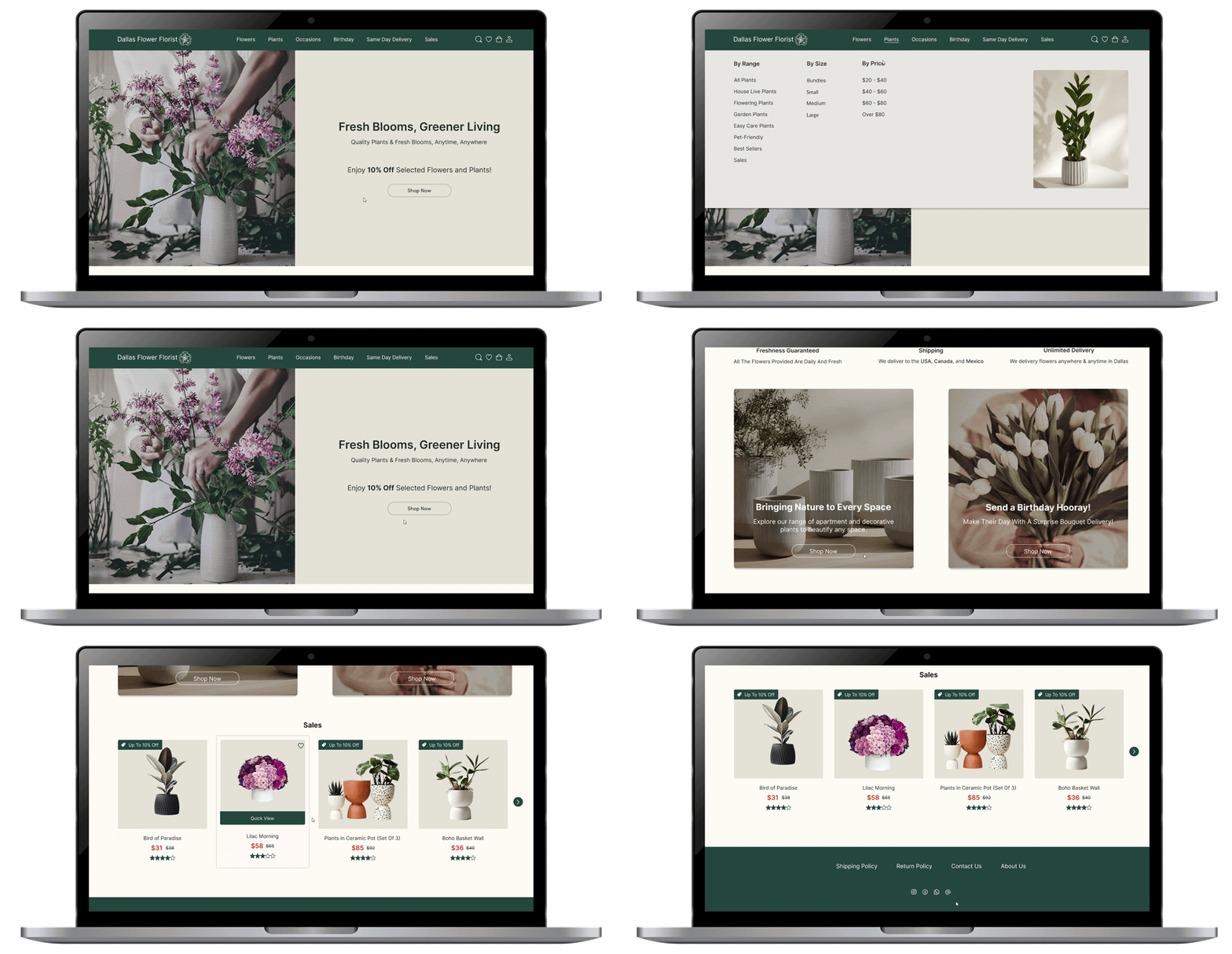
Take a look at our final high-fidelity Designs, complete with colors and images!

Final Prototype:

Here you can view the Berolina final prototype on Figma.

Reflections

What Did I learn?

  • The essential role of research in boosting product effectiveness.
  • Team collaboration ensured timely delivery and deadline adherence.
  • Testing and iteration enhanced user-friendliness

What Can We Do Next?

  • Following this, we’ll enhance the user experience by conducting additional usability testing and iterations to refine the user flow further.