Ikkari

Online Beauty Shop Application Design
About IKKARI

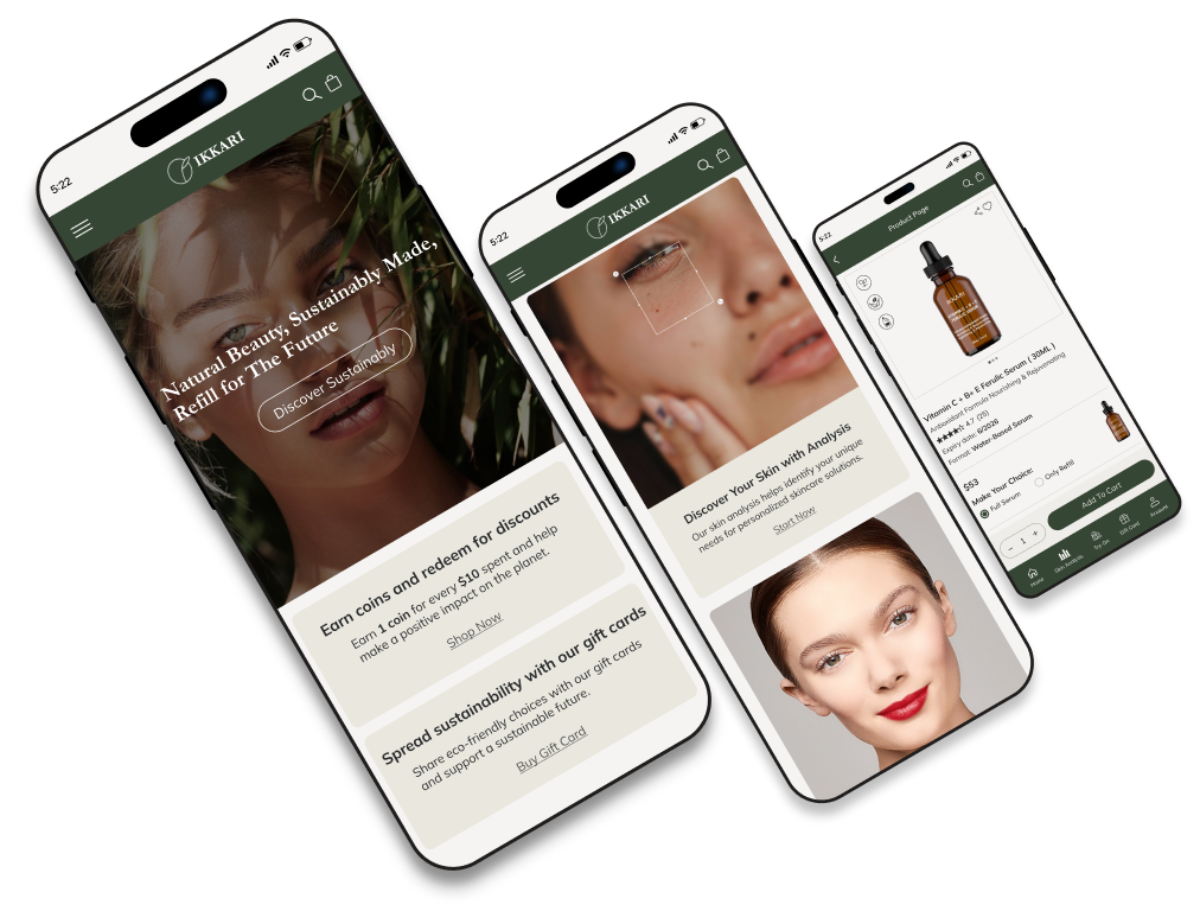
IKKARI is an online beauty shop focused on sustainability and refillable products. With skin analysis and virtual makeup features, IKKARI empowers users to make eco-conscious choices, promoting a sustainable beauty experience.
Project Overview

Role

UX-UI Designer

Team

Group of 3

Duration

Within 8 weeks

Tools

Figma, Photoshop, Maze Miro, Zoom

Stakeholder Needs:

Since this business is at the beginning of its journey, it requires a minimal, user-friendly application that encourages people to purchase sustainable products, boosts sales, and clearly communicates the services it offers.

Our Task:

  • Design an intuitive skin analysis flow.
  • Encourage users to purchase sustainable products.

Challenge:

  • How to spread sustainable fashion and educate people who don’t know about it.
  • How to motivate customers to purchase sustainable products.
  • How to effectively showcase business features in a clear and accessible way.
  • How to design a skin analysis flow that is easy and intuitive.
  • How to design a seamless user experience that ensures smooth navigation of all essential features.

Goals:

  • Encouraging people to spread sustainability.
  • Transparency in sustainability features of the products.
  • Educating customers and encouraging their purchase of sustainable products.
  • Designing an efficient and accessible skin analysis flow.

The Process

Our 8 weeks design sprint consisted of 4 phases, we took help from the double diamond method. there is no doubt that iteration is necessary during all phases.

Discover

Define

Develop

Deliver

Discover

To identify users’ challenges and develop effective solutions, we employed the following research methods:

  • Competitive analysis.
  • Interview with a different types of users.

Competitive Analysis:

We analyzed competitor applications, examining their features, workflows, and user experiences. This allowed us to identify key strengths and weaknesses, enabling us to refine our own app’s design and functionality for a more seamless and effective user experience.

Logos Of Some Competitors

 Top takeaways:

  • How to present business values and features.
  • The Importance of User Education and Effective Strategies for Educating Users.
  • Building Trust with Transparent Product Details.
  • Designing an Effective and Confusion-Free Skin Analysis Flow.
  • How to Streamline Skin Analysis Results for Clarity.
  • How to Present Recommended Products Effectively.

Interview (Qualitative Data):

We conducted interviews with 13 potential users to gain insights into:

  • Understanding User Awareness of Sustainability.
  • Identifying Motivators for Sustainable Purchases.
  • Exploring Skin Analysis Experiences and Challenges.
  • General User Experience with Online Cosmetic and Skincare Shopping.
  • Factors Contributing to Building Customer Trust.

 Top takeaways:

  • Limited awareness of sustainability and the need for more education.
  • A seamless skin analysis process, free of confusion and unnecessary questions, was expected.
  • Building trust through transparent product details and high-quality images was required.
  • Suggestions for encouraging users to purchase sustainable products.
  • Product ingredients and usage descriptions were needed.
  • For building more trust, the importance of reviews and ratings was emphasized.

Define

Persona:

Who is the user of the IKKARI application?

In order to establish tasks for our design, and to communicate information about the users that we collected during research, we developed a persona

User Flow:

What steps does our persona go through?

In the next step, we created a user flow to outline the steps our persona would take while completing the specified task, giving us a clear framework for the design process.

Develop

Challenges & Solutions:

What redesign decisions did we make?

After analyzing all of our research, we began to understand our project’s challenges and tried to find a solution in our design.

( Home Page )

(Skin Analysis Results Page)

(Product Page)

(Recommended Products Page)

Usability & Iteration:

What did our users think?

After several iterations involving the team, stakeholders, and target users, we arrived at the final version. Based on their feedback, we made revisions to the designed pages, which are summarized in the two sections below.

  • Phase 1: Heuristic evaluation (Mid-fidelity)
  • Phase 2: Assign Tasks & A/B Testing (After applying UI-Kit)

Phase 1:

We conducted a heuristic evaluation of our mid-fidelity prototype with stakeholders and users to identify usability issues early and highlight improvements before the high-fidelity phase.

(Home Page)

Deliver

UI Design Direction:

For designing high-fidelity interfaces, I defined a design system consisting of colors, fonts, and dimensions of elements that should be consistent on all screens.

Mood Board:

As a sustainable beauty project, our mood board showcases images, fonts, features, and UI elements that inspired the design, reflecting the brand’s commitment to sustainability and creating a harmonious user experience.

Our sustainability-inspired Mood Board

UI Kit:

Our UI kit consolidates all essential design elements, including buttons, icons, typography, and components, ensuring consistency and efficiency throughout the app’s development.

Usability & Iteration:

Phase 2:

This section highlights the changes made after repeatedly testing various tasks following the application of the UI kit.

(Refill Section)

(Recommended Products Section)

(Footer Section)

A/B Testing:

3-second Test:

Final High-Fidelity Designs:

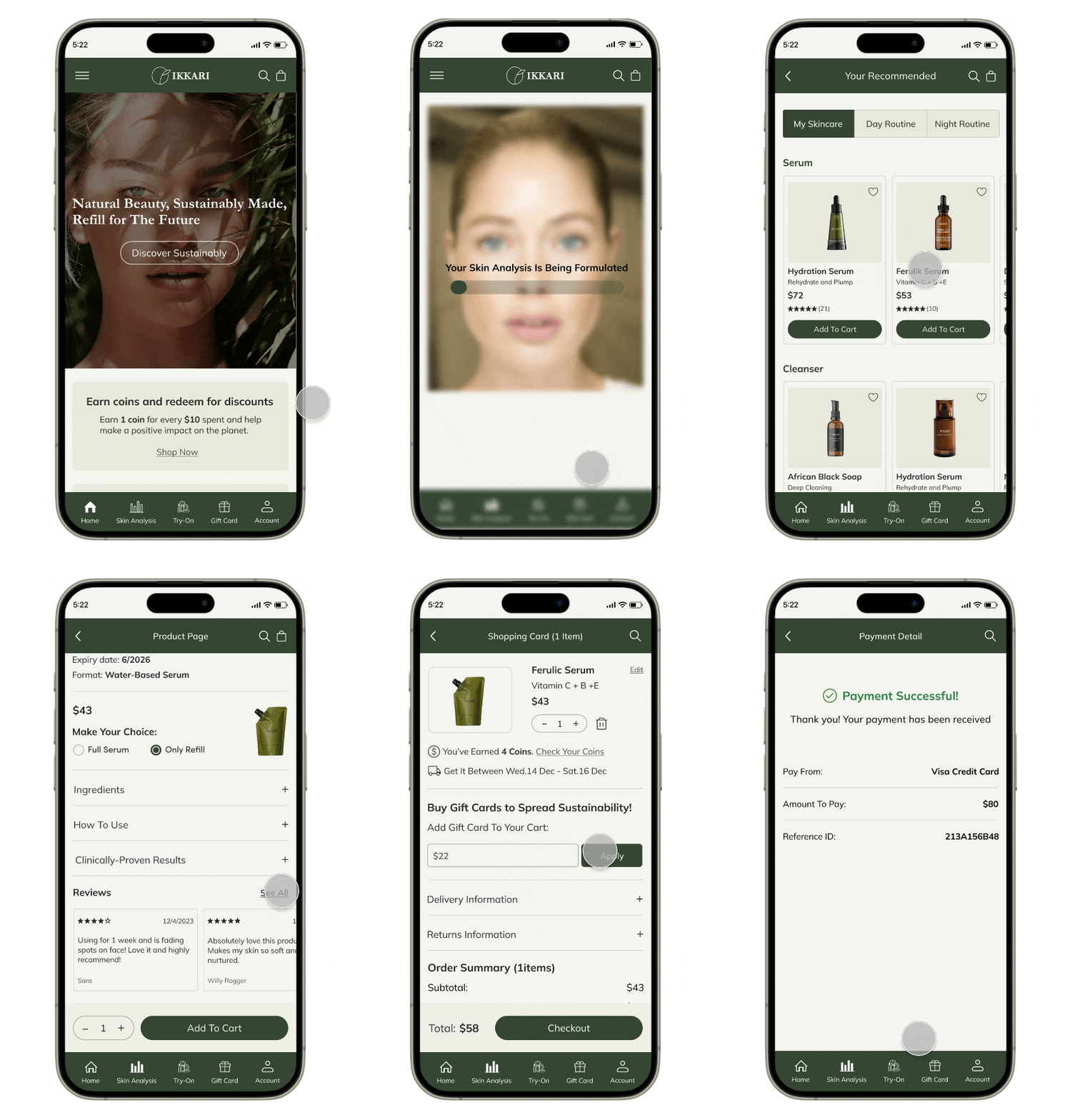
Now it’s time to take a quick look at our some final high-fidelity designs, which are complete with colors and images!

Final Prototype:

Here you can view the IKKARI final prototype on Figma.

Reflections

What Did I learn?

  • How to translate research into features that meet user needs and refine versions through testing.
  • The value of constant communication within a team, especially early in the project.
  • Testing and iteration enhanced user-friendliness.

What Can We Do Next?

  • Design the Virtual Try-On section to enable interactive makeup testing.
  • Create a Profile section for managing preferences